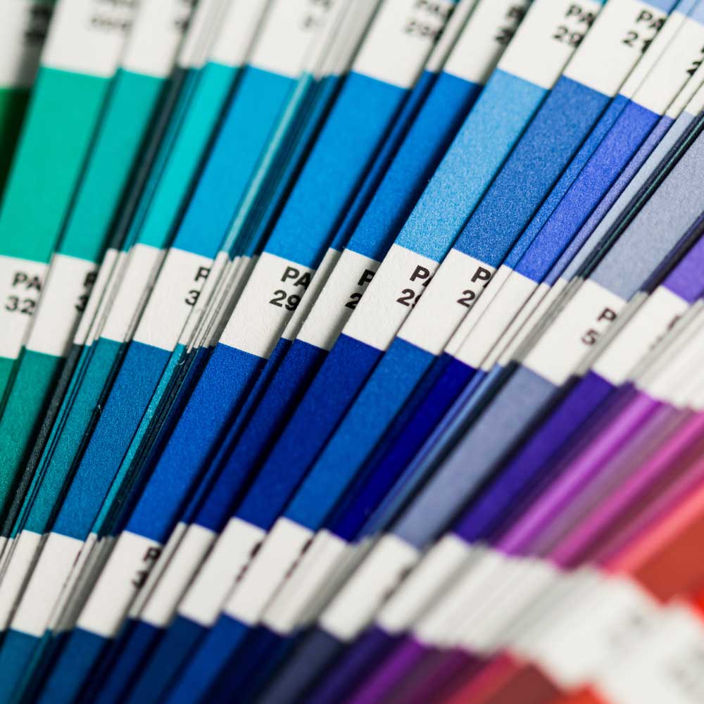
What are Pantone Colours?

Pantone Colours: Why They Are Essential for the Textile Industry

Pantone Colours are a global standard when it comes to precise colour reproduction. The Matching System (PMS) helps designers, printers, and producers to clearly define and reliably implement colours. Particularly in the textile industry, these colours play a central role. Why is that?

What are Pantone Colours?

Pantone colours were developed to standardise colour systems. Instead of relying on subjective colour descriptions, companies worldwide can access the same colour values. This saves time, reduces errors, and improves communication among all parties involved – from the designer to production.

Pantone colours and the textile industry

Download the swatches below

Why does the textile industry use Pantone colours?

In the textile industry, it often comes down to exact colour wishes. A scarf in 'royal blue' can be a deep blue for one person and a lighter blue for another. Pantone colours avoid such misunderstandings. Brands can rely on their colour world remaining consistent – even across different manufacturers and countries.

Pantone colours enable:

  • Precise colour specifications for fabrics, yarns, and prints
  • Uniform communication with suppliers worldwide
  • Consistent brand perception in fashion and promotional items
Pantone colour swatches on a table
Colour swatches / Pantone in the hand of a woman

Difference between Pantone C and Pantone TPX

Pantone colours are adapted for different materials:

Pantone C (Coated): For printing on coated paper (e.g. in the graphic and packaging industry)

Pantone U (Uncoated): For printing on uncoated paper

Pantone TPX: Originally intended for textiles (TPX = Textile Paper eXtended). Today part of the 'Pantone Fashion, Home + Interiors' (FHI) collection.


The same colour number can appear differently in the C and TPX versions because the substrate and pigments create a different effect.

Pantone as a trendsetter in the fashion world

Every year, Pantone announces the 'Color of the Year'. This trend colour influences collections in fashion, interior design, and product design. Many major brands align themselves with it. Pantone also offers seasonal colour palettes that help designers plan suitable colours for spring/summer or autumn/winter.

How Pantone colours are used in fabrics

Colour specifications from the company are communicated to textile dyeing facilities. They create so-called lab dips – small fabric samples with the desired colour. The designer checks whether the colour matches exactly. Only then does production begin.

It is important to work with reliable suppliers who have experience with Pantone specifications. Only then can it be ensured that a colour such as 'Pantone 186 TPX' looks the same everywhere – from scarves to blouses.

Pantone colours in fabrics
Pantone swatches on an artist's table

Corporate fashion and promotional items in Pantone colours

Pantone colours are also important in the B2B sector. Companies want their promotional gifts – whether scrunchies, scarves, or mitzvahs – to match their brand colour exactly. Pantone makes this possible.

An example: An airline orders scarves for the cabin crew. The company colour is a specific blue. Thanks to Pantone, this blue can be precisely defined and reproduced worldwide – without surprises.

Conclusion

All Pantone colours are more than just shades. They are a tool that connects design and production. In the textile industry, they guarantee quality, recognisability, and efficiency. Those who work with Pantone save time, money, and hassle.